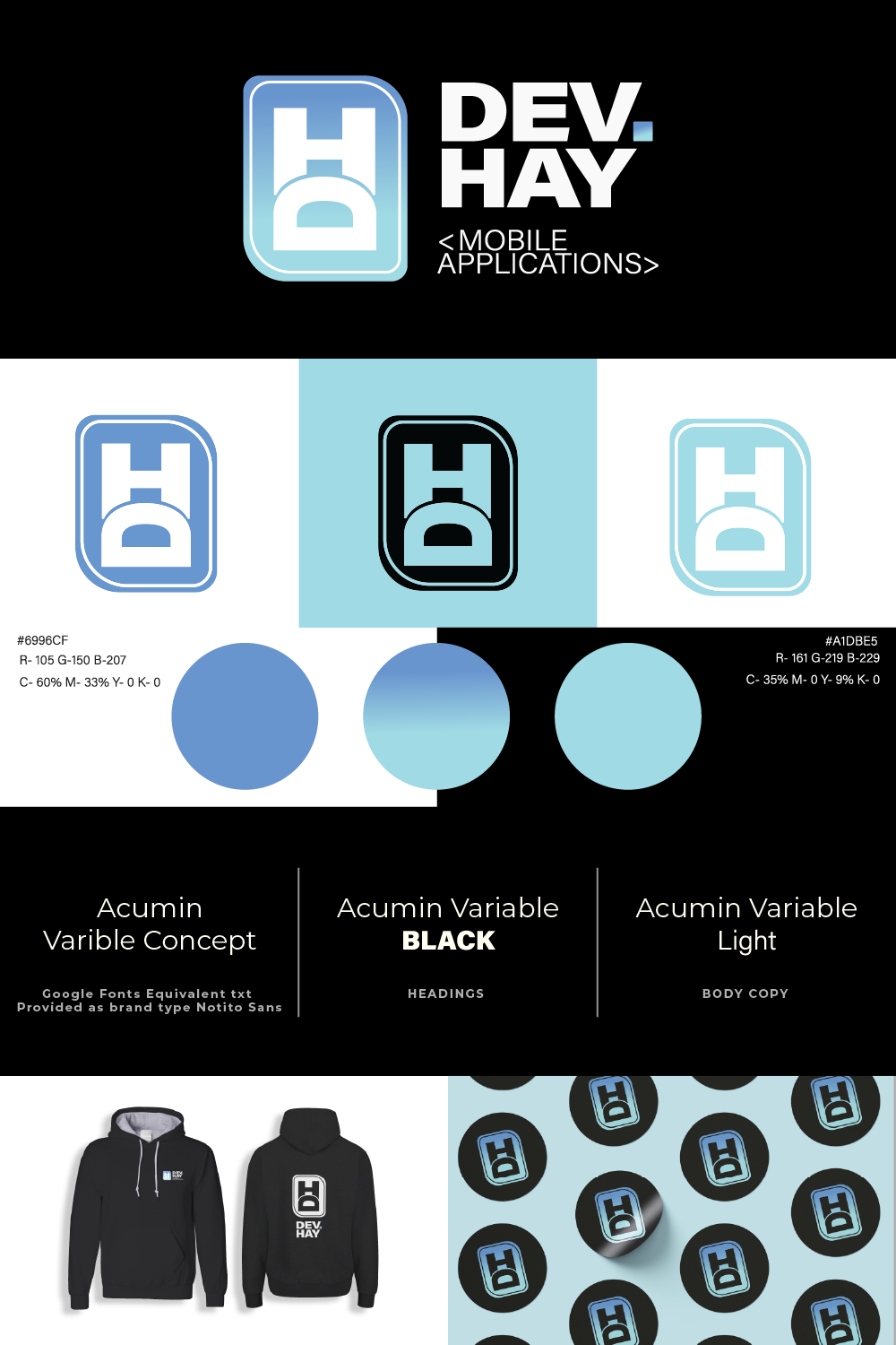
Dev Hay Branding
This project was a great experience to work with an excellent new app developer who wanted to develop a striking and imposing brand identity. Talking to the client was an important step of this project as learning about the motivations and energy of the client lent itself well to building a strong identity to match this.
A strong gradient and welcoming tones semiotically helps the trustworthynesss as well as the technology be communicated behind the person. The icon shape itself is even inspired by chips in processers and such. Avoiding sharp edges and agressive blocky-ness was a key part to the semiotic meaning behind this logo.
A clear sans-serif being paired with the icon was a choice made due to its variation in weight, the adaptability of a single typeface allows for a more consistent identity across the identity. In discussion and feedback with the client they were very happy with the representation of the logo, stressing the impertinence for all elements to be to work independently as well as all together.
Delivering a range of logo variations and mock ups for how these are to be applied the client has seen positive uptake and response from clients and peers which goes to show that this fits right into the desired space.

The Good Sauce Co.
A sauce company, family ran and built up into a subsequent restaurant made with Mama’s recipes! A heartfelt and genuine business with value and real people. This was important to communicate and was a leading point in discussion with the client.
A simple and familiar brand identity that has a comforting and also professional appearance whilst still feeling like it is hand-made and real. A primary logo with a combination of the icon and type that can also be isolated and stand alone separate from each other maximised usability to the client across sauce and restaurant usage, this was a route that the team favoured over any alternatives of the logo and subsequent logo use in patterns and packaging followed suit.
The water or sauce drop with the texture resonated with the client in a childhood filled with Mum’s cooking tasting a drop of the meals and sauces she made, mixed with the childlike drawing texture, successfully created the homely and nostalgic appearance the business were so keen on portraying.
Working with an independent and small business allowed for an intimate and detailed project to build up, getting to know the people as well as the business was a rewarding and great experience.
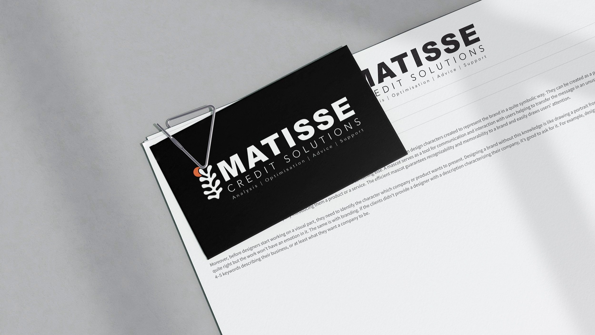
Matisse Credit Solutions
In a world where serious corporate design is overwhelmingly serious industry like credit solutions there is room for a stylised and imposing brand.
The namesake of the brand is that is influenced by Matisse, the famous painter and sculptor. This is in reference to creative solutions to financial issues. We found that the world of finance is very hard, cold and matter of fact. This could be seen as imposing or intimidating by a possible client. opening up a brand and making it more visual and less aggressive may help in the approachability.
Something we also greatly considered was how this logo could be used across the surrounding stationary, letterheads, emails, ect... This brand would work well broken down to its base elements, the strong bright colour mixed with the harsh juxtaposition of a black and white helps this greatly. We believe that this credit solution brand would be a strong competitor in an otherwise bland landscape and we look forward to looking into this further.
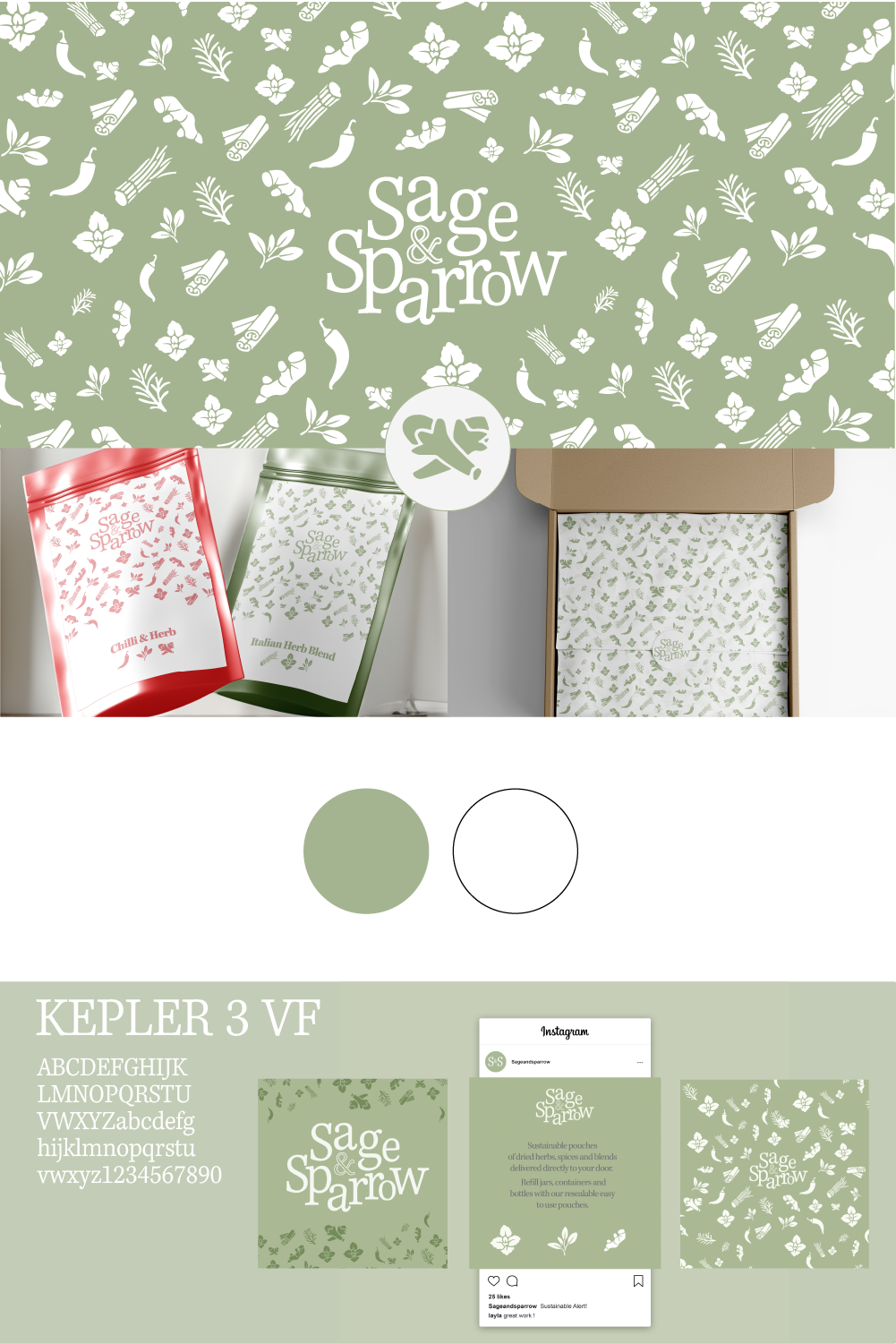
Sage & Sparrow (Conceptual)
The “At Home chef” and the “student chef” is a concept becoming an increasingly popular and comfortable concept with the convenience and resources now available to help virtually anyone learn how to cook. This leaves room for a more convenient and readily available source of ingredients. There are a lot of the vegetables-to-your-doorstep subscriptions however our client saw room to do this but with dried herbs and spices.
These packs of spices can be used to refill pots, jars and containers, removing the need for single use containers. Their vision details the spices singularly on sale as well as packs, regional and seasonal combinations as well as packs for marinades, brines and even Kimchi fermentation mixes. The aim is to provide seasonings for the experienced and the beginners too.
The access and ease of use is important for their vision as well as having a minimal impact on the environment with the service as the mailing subscription industry is a massive contributor to waste. We worked with the client to opt for sustainable resealable pouches, recyclable boxes and tape with water activated adhesive, this allows the full product to be recycled and helps the customer know that they are shopping sustainably.
The company wanted to present the brand as homely and friendly whilst still allowing for the knowledge and expertise to be communicated. We elected to use Kepler as the type due to its friendly and fun style whilst still maintaining professionalism and legibility. In the colours selected we used a Sage colour but through feedback we darkened this colour to be warmer and fit in with the rustic styling of our research phase. Working through the project side by side with the Sage & Sparrow Team we have established a brand identity that can span social media platforms, packaging and marketing materials too with hopes to develop a visually engaging E-commerce platform.
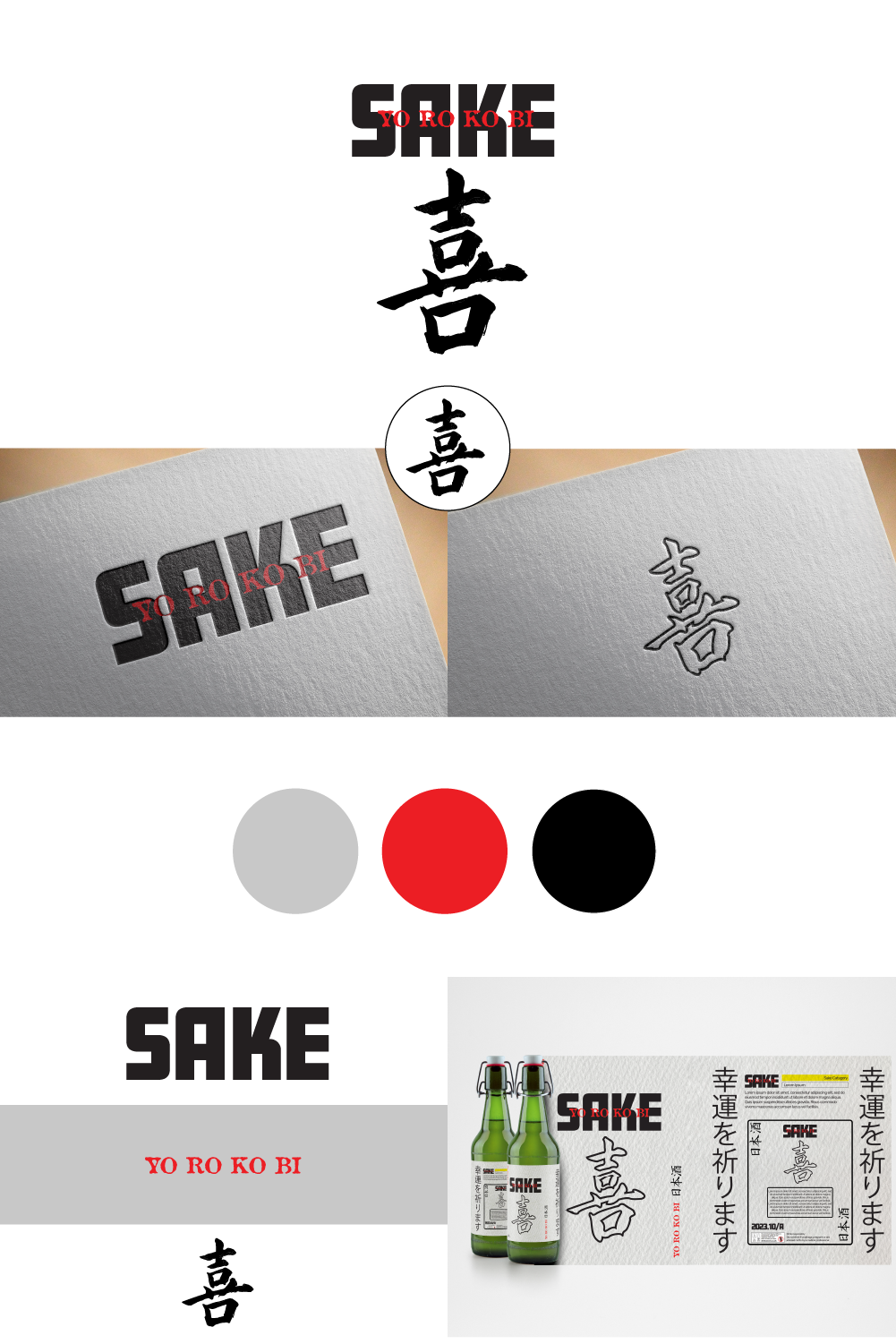
Sake (Conceptual)
A Sake brand named after the product, Sake is a traditional Japanese fermented rice spirit wine. I wanted to break off the rules from the current standard of sake packaging whilst still respecting the origins.
Yo Ro Ko BI is the phonetic for the word Joy or the emotion of joy. The consumption of Sake is at meal time a time when friends, family and lovers converge in joy and sharing. The logo mark of the kanji is the word Sake but in a brushed texture, this keeps in line with t he popularity of the appearance of Suntory whiskeys and gins.
I believe that the branding has been considered and measured in its use without appropriating, the Colours are reserved and in line with regulations. This projects was highly insightful in that i got to learn more about an ancient culture and learn to correctly apply changes and language uses. Opening my ability to work with international clients whilst researching certain requirements or limitations.